Sunday, May 4, 2014

CRI's WCTS Spotlight Blog for May 2nd, 2014

Hello and welcome back to CRI's WCTS Spotlight Blog,

Now that we are officially into the month of May one should be very cautious for the next six weeks. Historically, many commodity related business\'s use May as a seasonal pivot (where supply and demand influences peak) so one shouldn\'t be too surprised to see wild gyrations through this transitional period. Since we know most of the world\'s equity markets are very overextended I am troubled by what I see developing in the long end of the yield curve (see WCTS Blog post). It would appear bonds are starting to look more attractive relative to stocks. Couple all this with the turmoil out of Eastern Europe and I for one shall be reluctant to commit new money to ideas for a while yet.


As we fast approach the typical seasonal top for the North American economy it shouldn't surprise us to see the anti-equity-market proxy (bonds) start to look more attractive. While I am not suggesting a trade (low reward to risk ratio on setup prevents me from considering the idea) , I do respect the fact that we may see a nice rally from current levels. Three justifiable reasons suggest to me price wants to revisit the low 140 area in the not too distant future. 1. Inverted Head and shoulders price pattern target (outlined on chart). 2. Optimal Short Trade Entry (OTE) zone currently about 144 to 148 [keep in mind, institutions do not short down markets, this is the area that they will look to short to play this bear market - not near the lows here]. 3. Gaps near 143 & 145 need to be filled. Put it all together and I can comfortably understand a bond market rally - but as previously mentioned, because reward is about equal to risk I simply can not justify taking a trade....

That's all for this issue of the WCTS Spotlight,

Brian Beamish FCSI

The Canadian Rational Investor
the_rational_investor@yahoo.com
http://www.therationalinvestor.ca/RI_Tradents.php#wctsspotlight
http://www.therationalinvestor.ca

Sunday, May 19, 2013

CRI's WCTS Spotlight Blog for May 17th, 2013

Hello and welcome back to CRI's WCTS Spotlight Blog,

05/17/13: The recent bullish reversal in the US Dollar index continued this past week and has now confirmed (in my mind) the bullish scenario laid out in previous blog posts. With both ECB & BOJ on aggressive easing programs, the North American economy looks to be relatively attractive and indeed money is pouring into US dollar denominated assets. Of particular note, the Aussie dollar is now racing lower in a bid to play catch-up to the Yen. Additionally, from a macro perspective, things are taking a hawkish turn in Syria suggesting a global war premium is being built back into the market, something we haven't seen for some time. 


Since the US Dollar Index put in such a dramatic bullish reversal over the past two weeks I thought it only prudent to take a good look at the weekly and monthly charts to see if this recent price action is trying to tell us something. Oh boy, it seems to be! 

Regular readers will recall my WCTS spotlight blog from March 15th (link) in which I painted two potential scenarios for the US Dollar Index. After what looked like a nice double top it appeared just two weeks ago as though the bearish scenario was going to play out. Then out of nowhere a monster rally both broke the existing double top and forged through the significant highs from last summer. This bull trap caught many off guard (and in my mind) has laid out the true path going forward. As the charts above illustrate, two very well defined bull ab=cd patterns are currently at work. While it may take weeks, months and maybe even a quarter or two to get to the upside objectives, I feel confident of direction.

Since the US Dollar Index is our 'financial asset' proxy this generational cycle it is important to understand where it is headed and some of the broader implication of the trend. The trend in my opinion remains up for the US Dollar index. Regardless of fundamental reasons, I shall be looking for a stronger dollar index going forward, not a weaker one. And, until a top comes in or upside objectives (outlined on the two charts above) are hit, pull-backs represent buying opportunities while rallies represent profit taking windows. Additionally, conventional wisdom suggests US Dollar strength would imply US Dollar denominated commodity price weakness. Given this historical norm, I shall too be looking for a general malaise within the commodity space. Given my various bearish posts within the space of late (gold, feeder cattle, copper, et all) that supposition seems to be indeed correct.

That's all for this issue of the WCTS Spotlight,

Brian Beamish FCSI

The Canadian Rational Investor
the_rational_investor@yahoo.com

http://www.therationalinvestor.ca/RI_Tradents.php#wctsspotlight 

Sunday, March 31, 2013

CRI's WCTS Spotlight Blog for March 28th, 2013

Hello and welcome back to CRI's WCTS Spotlight Blog,

03/22/13: The end of Q1\'13 is here and so too does it bring the Japanese fiscal year end. Amid the seasonal ill-liquidity, the US dollar index is once again pushing back above the 83 level suggesting the fight between 83 and 84 isn\'t quite over yet. We will be watching that chart\'s resolution closely over the coming weeks per our recent WCTS blog posts and weekly updates. Seemingly to confirm this broader market bearishness, Bonds look to be bottoming, Copper looks to be topping and Healthcare (a sector that usually does well during bear markets) was the best performer through the entire quarter as suggested by our 1st 2wks study back in January. Lastly, with the recent announcement of US farmer\'s crop planting intentions released on Friday (where corn intentions are for the biggest US corn crop in more than 80 years) I thought we ought to take a quick look at the grain markets and what the charts might be suggesting there going forward. Additionally, this week I have included a short tutorial on Bearish Engulfing patterns (Japanese Candlestick price pattern) and putting those patterns into context given higher time frame chart analysis - enjoy...


When I read through the news pertaining to the rather dramatic decline in prices on Friday (news link: News of record corn crop shakes market) I am reminded of a lesson I learned many years ago in the commodities market, the best cure for high prices - is high prices! Interestingly, shortly following that barrage of negative sentiment, news articles like this started to appear (news link: Crop outlook bullish for corn soybeans) suggesting institutional demand (Ethanol) and a diminished planting of other crops (especially evident in Oats for example) may set a 'floor' for further price appreciation. With the fear of a re-occurrence of last year's drought conditions and/or an always persistent fear of flood it is no surprise we have a very tightly wound market with potentially explosive fundamental movement either way. 

So here we are caught right between the proverbial 'rock' and a 'hard place'. At the moment it literally feels like there is an equal tug of war of news going on and that seems to be confirmed by the price action. Now here is the 'rub' - as traders, we must always be asking ourselves, is the potential reward I may realize on this one particular trade justify the very real risk I am going to have to take. And as of Friday's price action, I don't see justifiable shorts on any of these one day moves. One by one, I can go through each of these grain markets and make just as compelling an argument for the bulls as I can for the bears and that unfortunately doesn't help our risk:reward ratio at all...

Of the six markets shown above, lets take a look at Corn since the news was so Corn centered. I find it particularly interesting that while big, Corn's move did not break the significant lows from only a month ago. 687.25 was the key weekly low (682 daily low from the May contract 03/07/13) and that is the number I shall be watching closely for over the coming sessions. If indeed, that bottom holds, then corn is actually still working a perfectly normal double bottom 'bullish' price pattern and may even be setting the stage for a massive bullish AB= CD price pattern heading into the summer seasonal peak. At the same time, we may very well be carving out a bearish AB=CD price pattern too. A break of 678.50 would confirm this and would imply a downside target just under $6.00 which coincidentally happens to be where some juicy gaps are that really need to be filled. So as you can see, not the best odds....really about a 50/50 bet... anyone got a coin??? 

As you all know, I am by nature a very conservative investor and according to the 'Two Rules of Investing', rule number 1 says we can't consider a trade unless we are absolutely confident of at least 66% accuracy. 50/50 is not 66%. Additionally, options prices are currently skewed for a 50/50 scenario. According to our options model (OnlyDoubles Trades) we can only consider an option purchase if it's current price is half of what we expect it's intrinsic value will be should the market move to our anticipated target. That only happens with we catch a market with too much of a bias in one direction or the other. Here, the market really doesn't have a bias (remember our tug-of war), so there really isn't an unfair advantage for us to participate.

Which brings us to our Educational segment on Bearish Engulfing price patterns and their appropriate use given the larger time frame chart analysis. Here then is a very interesting daily (above) and weekly (below) chart summary on the DBA agg. commodity ETF with particular emphasis on two 'Bearish Engulfing Patterns' as highlighted in Stockchart.com's predefined bearish engulfing pattern scan from Friday.


DBA bearish engulfing pattern

Current DBA weekly chart: http://scharts.co/Y1WnL7
 
The two 'blown-up' charts (#1 & #2) are the two bearish engulfing patterns I would like to concentrate on here today. Notice they both meet the text book definition of a bearish engulfing pattern and may look roughly the same - but alas, they are very different. When one looks at the weekly chart (below) we see that #1 occurred at the top of the price channel and there was a very well defined downside target (the very large weekly gap at $26.50). #2 has however occurred at what I would consider a very tough location. 

First off, from a seasonal perspective we must keep in mind, spring is often a 'pivot' period for the broader market and especially so within the agricultural sector. Specifically for the grain markets, we are now shifting back to a supply driven market rather than the demand driven market typical during the North American winter. Prices shall be driven by fear of flood or drought and will ultimately culminate with the Fall harvest. In the face of poor international demand, it is not surprising to see that prices themselves have fallen for more than seven months and have left a lot of gaps to the upside that really ought to be filled in at some point down the road.  

So with this backdrop (one very different then in late January) we are currently right up against a key low and Friday's action was unable to penetrate that low. The grain markets themselves were ugly but they did not break. Should they break, the very important low ($25.70 on this ETF) shall be broken too. BUT that has not happened yet and I do believe it is dangerous to assume that it will happen.

Given too, we will be entering the 1st 2 weeks of Q2'13 (and all the implications that go with that event), I will personally be reluctant to take any bets in earnest until that window is closed. I fear prices will test and maybe even break those significant lows early this coming week but then rally hard through the first two weeks as trapped shorts have no choice but to cover. Indeed, if it is one thing I have learned while working with the good people at TsT, there are/will be quite a few traders that would consider buying against the 25.70 low as a relatively low risk:reward long scenario.

So what is the point of all this then? Take away from this that not every bearish engulfing pattern is the same. Some occur at really good shorting locations, others occur at typical 'trap' locations. As always, nothing is guaranteed in the market and getting sucked blindly into each and every bearish engulfing pattern can be both mentally exhausting and financially debilitating. Take every chart pattern you see and put it into context given your higher time frame chart analysis. If they agree, then you may have something to work with. If not, beware!

That's all for this issue of the CTS Spotlight,


Brian Beamish FCSI  
The Canadian Rational Investor
the_rational_investor@yahoo.com 

http://www.therationalinvestor.ca/RI_Tradents.php#wctsspotlight 


p.s. fwiw, I personally prefer the concept of the 'outside downside key reversal' (using OHLC bars) in that the market opens HIGHER than the previous two period's highs and closes LOWER than the previous two period's lows. Notice that while both are text book candlestick 'engulfing patterns' definitions, #1 above meets the 'key reversal' criteria while #2 does not....

Sunday, March 24, 2013

CRI's WCTS Spotlight Blog for March 22nd, 2013

Hello and welcome back to CRI's WCTS Spotlight Blog.

03/22/13: The US dollar index this past week showed signs of fatigue any time it pointed its nose above 83.00. As previously mentioned, 83-84 represents a significant battle zone for the index and its ultimate resolution ought to give investors a guide as to 'fear' vs. 'greed' expectations for the coming weeks and months ahead. Given this is Japanese fiscal year end, we may see trend resumption once on the other side of that event. Interestingly too, that event will mark the beginning of Q2''13 and we shall be given yet another brief glimpse at what fund managers are doing with their new capital. Elsewhere, the professor of economics (HG Copper) had something to say this past week. While still contained within a larger channel, Copper prices registered a weekly double top breakdown suggesting lower, not higher prices ahead. With that in mind I thought we ought to take a look at what is going on there in this week's WCTS Blog.

High Grade Copper (HG) Weekly & Monthly


HG Copper review: Here again we find another commodity perched at or near 10-15 year highs and threatening to break down in earnest - quite a re-occurring theme of late. Unlike other markets, HG Copper's general trend itself has broader implications. Also known as the professor of economics, Copper is such a key componatant in manufacturing (from housing to airplanes to automobiles) that its direction is often a great proxy for global economic output. Rising copper prices equates to booming economies; falling prices equates to contraction. 


Fundamental review: 
On balance, I find it incredible how only 10 years ago Copper prices traded in a nice $.50 to $1.50 range for the better part of thirty years. Only over the past decade has copper 'come to life' (as this chart illustrates: link). While I can understand a revision higher in price given the destruction of the base currencies' fundamental value (US$) unless there is continued strong demand, prices can easily fall from these lofty levels and fast! The 2000-2010 decade was dominated by the building out of China's economy. Will that trend continue? Has that trend already started to reverse? Chin's political structure has moved away from the growth-at-all-costs model and Chinese stocks are reflecting that. Europe itself is in self-destruct mode as we know austerity will cut GDP growth not help it. And here in North America we are facing a fiscal situation that like the Europeans lends support to contraction not economic expansion. Even from a short term perspective, whatever housing demand there is this summer has surly been bought by wholesalers by now, so when I put it all together I am not quite sure how this market can maintain such high levels let alone move to new highs from here. Once the seasonal window closes (sell in May and walk away) I personally would be especially leery of owning this commodity in particular.

Technical review:  
Monthly (chart on the right above): Given the 'V' nature of the bottom in price from 2008, it shouldn't surprise anyone to expect a test of that low at some point down the road. While that big fat juicy target may be a little aggressive there are two significant downside targets that seem very realistic given the world's current fundamental situation. Should price move through the lows from October 2011, we will be setting up a monthly bearish ab=cd price pattern. The target on that pattern is about $2.50 and at the same time, there exists a nice little gap on the Monthly charts at that level too. The two together make for a compelling argument for that level to be traded to at some point in the future.  
Weekly (chart on the left above): Here is a very interesting situation. Price just this past week broke down through the most recent low to register a new weekly double top price pattern (red channel). At the same time, price is also caught in another equally powerful bullish channel (blue channel). These two forces are at work at present and are making for a very interesting battle. Given the low liquidity of Japanese fiscal year end and the fact that we are coming up on the end of Q1'13 I am reluctant to get too bearish of this recent breakdown. I for one am willing to wait for the first two weeks of the coming quarter to get out of the way and let the market tell me if this price breakdown is for real or is just a head fake in an illiquid market. But make no mistake - things are brewing here...

Summery
The professor of economics is generally not happy and we should listen to what he is saying. Lower highs and lower lows define a bear market and this past week's price action gave us just that. Given the current global economic backdrop that expectation shouldn't come as too big of a surprise. Given too the current market's ill-liquidity in the face of Japan's fiscal year end (and what may lie just on the other side of that event) and the transition from Q1'13 to Q2'13, I for one shall be watching HG Copper over the coming weeks very closely to see if this breakdown is for real or just a head fake.

 That's all for this issue of the CTS Spotlight,


Brian Beamish FCSI
The Canadian Rational Investor
the_rational_investor@yahoo.com 

http://www.therationalinvestor.ca/RI_Tradents.php#wctsspotlight 

Sunday, March 17, 2013

CTS Spotlight Blog for March 15th, 2013

Hello and welcome back to CRI's CTS Spotlight Blog.

03/15/13: The US Dollar index itself is at a very interesting cross roads here. As pointed out in this week's WCTS Blog, we are either at the end of a bearish Bat harmonic pattern (which would imply lower levels from here) or we push up through the 2012 summer peaks (suggesting much higher levels to come). Regardless, the area between 83 to 84 is a very important one and I for one will be keeping a close on how it resolves. While the bond market has yet to be convinced the North American economy has indeed turned, equities are enjoying what appears to be a flight back-into-risk. The fact that all world indices tracked are now pointing higher suggests we are closer to the end of this run then the beginning. Considering seasonality, I wouldn't be surprised if the spring/summer of 2013 marks an important peak. Interestingly, the rally itself is coming from unexpected sectors as our ABG trade (AAPL, Bonds & Gold) takes a break. Indeed, out-performance from sectors like pharmaceuticals shouldn't come as too big a surprise given CRI's 1st 2wks of Q1'13 study suggested that would be the case. Have the metals been beaten up a little too much? Recent WDB Options Model screen results would suggest so as several 'get paid to take a position' trades have emerged of late.

US Dollar Index (Weekly)


British Pound vs. The US Dollar (Weekly & Monthly)

 
As highlighted in recent weekly commodity trend summary posts, there are some interesting wranglings going on with the currency space of late and I thought we ought to take some time this weekend to look at the US Dollar Index in general and one of its trading pairs (The British Pound) in particular.

The US Dollar index
The greenback itself has been under relentless cyclical pressure since the day George Bush Jr. took office some 12 years ago. The coupling of the generational cycle turn ('greed' cycle peak into 2000) and absolutely horrible domestic policy culminated in the United States of America being pushed to the literal brink of bankruptcy by 2009. Once it was revealed how bad the situation really was and the US Fed established itself as a dependable 'lender of last resort' (and at considerable risk I might add) both a floor in the US Dollar was established and 'fear' proxies (like gold) calmed appreciably. 

So the question at this point seems to be, ok, what's next? The underlying fundamentals within the US economy have been supportive of both a stronger US dollar itself (interest rate spreads are attractive relative to the rest of the world) and a stronger US domestic economy (US corporate earnings are good and the yield curve remains expansionary). Until either the Fed signals an end to its current 'low interest rate' policy or international demand for US paper wains I see no change in that backdrop. Which brings us to the charts. The first chart above is the US Dollar index and it is in my opinion that the index is at a very significant cross roads. Should this be a 'Bearish Bat' harmonic pattern (where point d. would represent the end of our counter trend rally) we should see prices fall appreciably from current levels. Should this be a bullish AB=CD harmonic pattern (where point B would represent the beginning of a whole new longer term leg higher) we should see prices rally appreciably from current levels. While the jury is still out on the broader world economy, I myself will be looking to see how the index acts in and around this 83 to 84 level over the coming weeks. This is what I would consider the battle zone. If the bulls win we blast through 84, if the bears win we fail at 83. 

So are there any ques for investors that might help guide expectations going forward? In the short term we do still have seasonality on the 'commodity bulls' side. Once that window closes (Sell in May and walk away) my bullish enthusiasm for commodity ownership (and respective US Dollar bearishness) shall be tempered. It has been my general belief that the public is 'too long' commodities in general. Given my recent comments on the risks of owning such assets (WCTS Blog posts on Gold and F. Cattle of late for example) my general feeling is for lower commodity prices and a stronger US dollar over the medium term. Consider too, Democrat US Presidents are historically US Dollar bullish (as their constituents are typically urban rather than rural) a strong US Dollar policy in general shouldn't be a surprise through Mr. Obama's second term. While these two arguments are fundamentally US Dollar bullish, I myself am going to wait for the break of 84.245 to confirm it technically and I wouldn't be surprised if it takes us getting through the seasonal 'peak' to do it.

So lets take a look at what is going on internationally to see if there might be any hints there. The second chart included in this week's blog is on the British Pound vs. The US Dollar and I think it has some interesting 'tells' to it.  There is no doubt about it - this is a bear market! The question for me is, how bearish is it? In exact opposite fashion to the US Dollar index (as expected) the British Pound is literally on the brink of a significant collapse. Indeed, I remember reading stories of traders getting their 'big break' on the devaluation of the British Pound back in the late 1970's and early 1980's - is history repeating itself here? Believe it or not, the Monthly B. Pound chart is painting a target below parity with the US Dollar - or about $.50 lower from current levels! If this chart isn't a wake up call for US Dollar bears, I honestly don't know what could be. While the monthly chart does look ominous, the weekly chart does look a little washed out. Selling below 1.50 seems a little late to the trade but any counter trend rallies back into the 1.60 area would be considered an attractive shorting area (looking to buy Jan, 2014 or beyond Put options) and I shall be keeping an especially 'peeled eye' on this potential trade going forward.

That's all for this issue of the CTS Spotlight,


Brian Beamish FCSI
The Canadian Rational Investor
the_rational_investor@yahoo.com 

http://www.therationalinvestor.ca/RI_Tradents.php#wctsspotlight http://www.therationalinvestor.ca

Sunday, February 17, 2013

CTS Spotlight Blog for February 15th, 2013

Hello and welcome back to CRI's CTS Spotlight Blog.

02/15/13: In what seems to be a straight move out of the Yen and back into the EuroFx, the US dollar index has gone rather sideways of late (with maybe a new slight downside bias). As the Yen itself has entered a weekly oversold condition (rather rare in itself) regional stock markets have either hit or exceeded upside price objectives. Indeed, stocks globally have enjoyed a rather market friendly fundamental backdrop through Q1\'13 so far. Seeming to confirm this, the market's classic fear proxy, gold, hasn't fared well of late. Indeed, recent warnings regarding gold seem to have been warranted; but now that weekly downside objectives have been hit appreciably lower prices from current levels (for the time being) may be asking a bit much. Recent talk of Germany 'being more like Spain' and Japan's intention of spending their way out of their current economic malaise suggests global fiscal austerity may be nearing an end. Lastly, this week\'s CTS blog spotlight takes a look at another long term commodity price chart that looks a little top heavy - Feeder Cattle. While it may not have broken down yet, does further upside price appreciation seem realistic?

Every once in a while it pays to keep an eye on the longer term price charts just to keep yourself honest. We all love bull markets, but at some point we have to ask ourselves if further upside price appreciation is both realistic and warranted. 

Recently, we here at WCTS Blog took a look at the long term price chart of Crude Oil (as a leading commodity)and asked aloud if such a price pattern could be in gold's future (a lagging commodity). While gold seems to have begun its slow correction phase (with plenty of ebb and flow over the coming months/quarters ahead) playing commodities short through the 17.5 fear cycle (of which we are currently in year 12-13) can be very profitable but also dangerous too. Indeed, I would expect short term rallies (back into resistance) to be violent and profit windows on short positions to open and close very quickly. While I love the notion of our 'home-run-trade' ($110 Dec. '13 Put option on GLD), I wouldn't be looking to touch that position unless it doubles in value (at which point it is always a good idea to sell half your position).

Having said that, I think the more important question traders ought to be asking themselves is does ownership of gold at +$1500/oz represent a cheap or expensive holding? Considering our long time held technical belief in the 50% rule, long term ownership of any commodity  well above that level is inevitably asking for trouble. Additionally, we as asset owners are not only looking for stable prices but indeed we need rising prices. Without rising prices there can be no capital gain, which makes this entire endevour pointless. So not only do we need to ask if ownership is risky but also ask if capital gain potential is realistic. Unfortunatly, when it came to +$1,700 gold that simply was not the case - for the time being.

Which brings us to our commodity in focus this week, Feeder Cattle. Without a doubt, Feeder Cattle has enjoyed a rather noticeably rally over the past four years. at +130 weeks it has been by far the longest running weekly bull pattern WCTS has followed in its short history. Prices briefly tested the key lows under $90 in 2009 only to peak just above $160 into early 2012. The historical breakout through $120 represented a significant re-pricing of Feeder Cattle and in the face of topping grain prices, farmers had little new incentive to bring product to market. As long as price remained above the very powerful short term uptrend line, there really was no telling where she was going. But with the recent weekly failure just below that significant uptrend line, one has to seriously be asking themselves if further upside objectives are realistic? At the moment, price is caught in a channel (133 to 155) and it is really a coin toss in the short term as to which mark will be traded at next. The point here is, does owning Feeder Cattle represent a low risk or high risk proposition? Considering many institutional traders watch for the OTE Fibonacci levels for 'low risk' trade entries (a 70.5% retracement of the primary move & currently near the 108 area) one might argue there is realistically more than $35 (or 25%) of risk owning Feeder Cattle at these levels. That's a lot of risk!

Indeed, it is so much risk one might consider a Put option at some point along the road here. Playing the short side during 17.5 year 'fear cycles' (as pointed out previously) can be both rewarding and dangerous. Like the GLD Put recommendation made earlier, this would be a very long term trade for commodity options and as a 'home-run' trade ought to be treated as so. That means it ought to be only considered with money that you can afford to lose. While Feeder Cattle's potential monthly top is still early in the making I shall be watching for a an OnlyDoubles trade possibility and will of course keep you all informed should one come along. 

Speaking of which, our last OnlyDoubles trade seems to be working nicely as bond prices within the US continue their correction. June TLT 120 Puts suggested at $4.00 are currently $7.00. Those that were able to take the trade ought to have orders working at double your purchase price (hence the name OnlyDoubles!) or at $8.00 or better. Once filled on half the position (and you have your original investment capital back in your hands) feel free to ride the remaining to where ever your personal comfort level takes you.

That's all for this issue of the CTS Spotlight,

Brian Beamish FCSI
The Canadian Rational Investor
 the_rational_investor@yahoo.com
 

Sunday, December 23, 2012

CTS Spotlight Blog for December 21st, 2012

Hello and welcome back to CRI's CTS Spotlight Blog.

12/21/12: Well the world didn't come to an end on Friday so now back to reality. Interestingly, as we approached the significant date we saw both 'fear' currencies (US Dollar & Jap. Yen) continue to sell-off. The dollar is now at key support so it should be interesting to see where we go from here. Conversely, the Yen has broken a well defined uptrend line and Asian stocks have continued to rally smartly off that reversal. One could argue that the current 'fiscal cliff' concerns have acted as a natural break on the current economic cycle. Should that be the case, and we get some sort of resolution, we may actually be setting the stage for a substantial move higher through 2013. That is a rather big assumption at the point and I for one shall let early January's price action (the January barometer) tell us what to expect for 2013. Regardless, stocks appear strong, inflation appears in check (for now) and commodity prices are relatively calm for the time being. Enjoy your holiday and get ready for a wild 2013.


While doing my WCTS today something jumped out at me. After considering this past week's price action in two market's in particular I thought a longer term perspective was needed. After looking at the monthly charts I became convinced that something of significance ought to be brought to CRI's broader reader base - hence this week's WCTS blog post. I won't tell you the market in particular now because I don't want your personal bias to impair your judgment (those shrewd investors out there ought to know exactly what market I'm talking about by just looking a the chart and reading this weeks CTS). 

Anyway, on to the analysis. The chart to the left above is a monthly continuous contract for Nymex Crude Oil. It is important to note that energy is a 'leading' commodity. Often the broader market gets its' ques from energy prices. Once energy prices started to rally, they basically dragged the rest of commodity land (and price levels within our society) higher with them. Notice the dramatic run up in price through the period from 2004-2008 (about 4 years). Notice too the long term trend line (drawn off the significant lows). It was incredible to watch price triple what it was from the panic lows in January, 2007 ($50) up to its peak (near $150) by mid 2008 - but it did. It was just as stunning to watch the whole thing fall apart to hit a low (around $40) by the end of that year - but it did. If you had suggested such a thing prior people would have thought you were nuts - but it happened! Indeed, there were very few who could see this whole thing from start to end, but those who did catch either side made a handsome sum (regular readers will recall CRI's recommendation to buy Dec, 2008 $90 puts at $2,500 in June of 2008. That option went to over $50,000 by time all the dust settled in December). Crude oil's 'bubble' burst and it burst hard. Once it had broken, the question really was, where would it bottom? While yes the market did move beyond the long term trend line on its inital burst lower, it is interesting to see how we have basically gyrated around that long term trend line over the past couple years as the dust settles from the disaster. Additionally, it is interesting to see how the original significant monthly breakout price ($80) has acted as a magnet during the current market confusion.

So now that brings us to the chart on the right. If someone had told me five years ago that this market was going to triple (in five years) I would have thought they were nuts - but it did. I am sitting here today, wondering aloud...."if a 'leading' commodity (like energy) can do a massive 'V' top, is there any reason why this 'lagging' commodity (fear proxy) can't?"... If one draws the same long term trend lines (as Crude's) we see that current long term price support for this market is around $1000 or 40% below current levels (40%!!!!!). Additionally, price broke out on a monthly basis from around that same level when it started its run into late 2009. It took the energy market less than six months to correct back to that long term trend line - could the same thing happen in this market??? Unfortunately, I have been playing this game for so long I already know the answer, the question for me now is not 'if' but 'when'. Considering WCTS just gave a significant weekly 'sell' signal on this market, I would be very reluctant to own any asset related to this market for at least the next year or so...Furthermore, Like CRI's recent foray on the short side of the bond market (through TLT put options) I do believe there is an OnlyDouble's trade here and shall be looking in earnest for acceptable options to consider over the coming weeks.

Have you figured out which market it is, yet??? 
blow up this script to see the answer........................................ gold

That's all for this issue of the CTS Spotlight,
Brian Beamish FCSI
the_rational_investor@yahoo.com

Sunday, December 2, 2012

CTS Spotlight Blog for November 30th, 2012

Hello and welcome back to CRI's CTS Spotlight Blog.

11/30/12: While the US dollar index itself was little changed this past week, the Japanese Yen was anything but. After breaking down through support just two weeks ago, the Yen is in virtual free fall as talk from the BOJ (about a need for further stimulus) and a general 'risk-on' tone have both helped to bring the Yen down dramatically. In almost reverse fashion to Europe though, regional stock indices look rather bullish in the face of Yen weakness and is the focus of this week's WCTS Spotlight. Elsewhere, it is interesting to see the historical relationship between the grain and meat markets play itself out. Grain prices look rather weak and conversely meat prices look strong - is a spread trade in Oats/Hogs developing?


As a follow up to recent posts regarding how poor Europe looks from an investment landscape, I though this week we ought to take a look at Asian markets and what the current currency gyrations may be implying for the region in general. Interestingly, the Japanese Yen has acted almost opposite to that or the Euro. Unlike the very weak Euro-Fx, a strong Yen seems to be what is holding this region down. Considering how dependent Asian markets are on manufactured exports, it shouldn't surprise anyone that a strong Yen is literally killing Asian companies. As we have pointed out in the past, currencies are often driven by short term interest rates (and more importantly, the public's perception of how secure those returns will be). When the US economy collapsed (and with it US short term interest rates) there was no longer a premium to hold US paper over Japanese. Additionally, many investors have come to believe North America will have to go through a 'lost decade' similar to that Japan just went through. Given this backdrop, it was no wonder investors were fleeing the US dollar and running into what it perceived to be the only other reliable 'safe haven' to park their money. The Euro itself is simply not a viable alternative and you can only put so much money into gold. 

With the recently released better than expected manufacturing data out of China (linked pair to the US dollar) and encouraging US housing market data, that 'panic' flight into the Yen seems to be waning. Couple this with a horrific domestic economic situation within Japan itself and escalating tensions with its trading neighbors and the end result could be an equally violent move out of the Yen. The question at this point, does the weekly support line (we are fast approaching) hold? We have just filled in an important gap and have made a text book OTE (70.5%) Fib. retracement so odds are there could be a sizable bounce into the end of the year. Regardless of the short term gyrations, we ought to appreciate the simple fact that the Yen's relentless rise seems to be in check (for the time being) and local economies seem to be cheering the news.

Looking at the price charts of the individual countries in the region we see that indeed, stocks are pointing higher, not lower here. It is interesting to see Japanese stocks turned violently higher on the break in the Yen and until the Yen itself shows signs of turning I believe the wind is at these countries backs not in their faces. I do see a nice little gap on the Nikkie (quite a bit higher than where we currently are) that suggests once filled we ought to see some cooling down in price appreciation. That gap seems to correspond well with the other countries upper channel boundaries and those channel lines shall represent my collective resistance zones going forward.

As has been pointed out elsewhere, we are now comfortably into a very healthy season for stock investors. Typically we enjoy a 'Santa Claus' rally into Christmas and with the US Presidential election, we have an added seasonal boost into January's inauguration.....

as one of my trading partners used to always tell me, "make hey while the sun is shining my boy...."  

That's all for this issue of the CTS Spotlight,
Brian Beamish FCSI
the_rational_investor@yahoo.com

Saturday, November 17, 2012

CTS Spotlight Blog for November 16th, 2012

Hello and welcome back to CRI's CTS Spotlight Blog.

11/16/12: The US dollar continues to show strength as now a rapidly hotting up situation within the middle east adds to a general risk-off environment. Of particular note this week, Europe\'s woes are starting to show in earnest among the bigger previously thought impervious nations of the North. Austerity may be this generation\'s 1930s tariffs. One by one the PIGS nation\'s of Europe have watched their own economies crumbled in the face of dramatic self imposed GDP reductions. Now it appears it is Europe\'s leading northern economies\' turn (this week\'s WCTS focus). Hopefully, the academics within North America can talk the lemming (North American economy) off the cliff (the fiscal-cliff rather) before we too shoot ourselves in our collective feet. Elsewhere, grain prices look to have indeed topped heading into the demand driven portion of their marketing year. Since global growth is currently in question and a risk-off atmosphere prevails, the cure for high grain prices at the moment seems to be indeed that - high grain prices.


As a follow up to recent posts regarding the noticeable bottom in the US dollar index and corresponding top in the Euro-FX, I though we ought to take a look this week at the coincidental breakdowns in the European stock markets. This collective break is significant in itself as the fundamental news out of the region seems to be rather bleak. This past week saw the Euro-zone officially fall into recession (News Link) with growth expectations pegged for the 2013 at a whooping 0.1% (and that may be optimistic). Interestingly, of specific note this past week, German itself is starting to now starting to feel the pain as its ZEW Economic Sentiment reading came in much worse than expected. Austerity is taking its' bite, people are expecting contraction and it is now feeding on itself. Money multiplyer theory would suggest these economies will not only feel the effects of the government mandated cuts but also the ripple effect of the cuts and then the ripple effect of the ripple effect etc. Europe does indeed have a long fundamental road to recovery ahead of itself.


So with this fundamental backdrop, lets take a look at the technical picture and see what it has to say. First off, it would appear the breakdown in the UK & Germany are well contained within broader bull markets. This supports (for the time being) the notion that the 'rich' northern nations of Europe are in better shape than their southern neighbors. Having said that, neither of these countries could break their 2011 respective highs so a failure here may lead to a serious test of said uptrend. Italy on the other hand is firmly within a bear market and the recent failure came well below previous peaks suggesting prices ought to test recent lows at some point in the not to distant future. It isn't even worth looking at the 'PIGS' nations charts - they are all much worse. This brings us to France - where I believe the market's attention is closely focused. France is right on the edge of doing ok and breaking. Notice the battle at the previous peaks not seen in Italy. Notice too the failure just this past week through our most recent support low. Notice too, a break of this uptrendline leads to a lot of open space. I for one shall be watching the developments out of France closely for any tells as to how bad  bad might get.

The entire globe seems fixated on the US and it's fiscal cliff while not paying much attention to what is going on in their own back yards. As mussed about in my CTS commentary, it would seem North Americans take these kinds of 'cliffs' more seriously than in Europe. And indeed, it would appear politicians over here are listening (News link). I wouldn't be surprised to see a catalyst around this event. At the same time I do not see the same interest out of Europe at the moment. This to me feels dangerous as investors there seem reticent to the fact that prices are heading lower and their economic situation is gong to get worse not better in the near future - European stock investors beware!

That's all for this issue of the CTS Spotlight,
Brian Beamish FCSI
the_rational_investor@yahoo.com

Saturday, November 10, 2012

CTS Spotlight Blog for November 9th, 2012

Hello and welcome back to CRI's CTS Spotlight Blog.

11/09/12: In what can only be described as a classic 'buy on the rumor, sell on the news' event, the pre-election rally (on the hopes of a long shot win by the GOP challenger & a promised tax cut) not only cleaned out many weak shorts but also relieved a rather over-sold market condition. The subsequent price failure not only took back the rally but also broke to new lows in many cases. Meanwhile, the very noticeable bottom in the US dollar index continues to build as many of its major trading pairs are looking rather weak compared to the greenback. What is most interesting to me, is how quickly the major media outlets have switched their attention from all out election blitz to the impending 'fiscal cliff'. Indeed, as I have been worrying about for a while, we ought to see some sort of climactic capitulation around that event. Having said that, the event itself is a little over two months away and given the fact that the public is paying attention (and selling into the media frenzy), it wouldn't surprise me to see a bit of back filling through this seasonally bullish time of year.


As a follow up to last week's post on the weekly US dollar index (and its associated potentially bullish turn) I thought we could take a moment this week and look at its major trading pairs (Euro-FX & Yen) and see if they are trying to tell us anything. The chart on the left above is of the Weekly Euro-FX vs. the US dollar and the chart on the right is of Weekly Jap. Yen vs. the US dollar.  These two charts seem to correspond with the general tone in the Greenback - that being a move away from 'risky' assets and a preference toward those of the most trust-worthy central banks.  Specifically, The Euro-FX broke down this past week just below a key resistance line. This failure below the 50% level suggests inherent weakness and does suggest a test of this past summer's lows may not be too far off. Notice too, the tops on the Euro are rather rounded (with multiple tests of the highs) while the lows are all 'V' shaped and rather violent. This in itself is a hallmark of a bear not a bull market. Switching to the Yen, we see that it just recently tested its 50% level and once again it held up. In what appears to be a consolidation just below the recent extreme highs, the 50% level has become a defacto neckline of a massive Head & Shoulders price pattern. If so, one ought to expect some sort of 'right-shoulder' price action over the coming weeks/months ahead.

Since we know Euro-land interest rates are general still higher than both the Japanese and US rates, we must assume that if Yen and Dollar are rising in unison vs. the Euro we must be in a 'flight to safety' market. As a fundamental back drop, I believe this news article from Bloomberg summarizes the 'risk-off' environment that currently dominates the investment landscape.

Between the 'PIGS" nations of Europe (and their on-going debt sagas) and the pending US 'fiscal cliff' there is plenty for investors to be concerned with going forward. Having said that, I think if an investor gets wrapped up in the short term market gyrations they often miss the bigger picture (seeing the forest through the trees). Something significant is going on and I don't think it is being fully appreciated. If we look back at our longer term cycles we ought to notice that The US Dollar usually underperforms through its 17.5 year 'fear' cycle. The D-mark & the Yen appreciated dramatically through the last two cycles (Nixon taking the US off the gold standard and Roosevelt's currency devaluation) and the same ought to hold true today. One should not be surprised to see a powerful long term uptrend at work in the Yen. and it shouldn't surprise anyone to see efforts by Japanese Central Bankers to reverse that trend as futile. Here lie's (in my opinion) the current market conundrum that seems to be missed by many. A German based currency should be very strong right now too. This in itself should keep German exports in check - but it isn't. Because of the 'PIGS', international investors are reluctant to buy the Euro and German companies are enjoying massive 'artificial' gains. At the same time, Euro central bankers are offering the market a premium (spread between short term interest rates to that of the other 'reserve' currencies) and the market still doesn't want their paper. Something has to give...

I for one am not quite sure how this is going to resolve itself but it is an ongoing concern I have. How does a situation like this usually resolve? I do recall reading stories of many 'market wizards' who got their big break by seeing a significant change coming and building a relatively low risk position into that event, I wonder if this is one of those situations? Something I will give considerable thought to going forward and maybe you ought to too...


That's all for this issue of the CTS Spotlight,
Brian Beamish FCSI
the_rational_investor@yahoo.com

Sunday, November 4, 2012

CTS Spotlight Blog for November 2nd, 2012

Hello and welcome back to CRI's CTS Spotlight Blog.

11/02/12: The previously mentioned piercing of the 80.31 level in the US dollar index proved to be a significant event but wasn't truly confirmed until the later part of this week's trade. While its' previously registered bull ab=cd target may be a little aggressive, the index is moving higher and a test of the mid summer peaks isn't out of the question as we approach the 'fiscal cliff'. Will this coming Tuesday provide any real surprises? Considering intrade.com has Mr. Obama wining by a margin of 66% to 33%, a 74% likelihood of the Democrats keeping control of the Senate and a 94% chance of the Republicans winning the House - a surprise doesn't seem likely. Indeed, four more years of same old same old as we march toward the anticipated 17.5 year 'fear' cycle peak in Q3'17.


As we approach the all important US Presidential and US Congressional elections this November and the looming 'fiscal cliff' come January I thought it would be of some value to take a look at the US dollar index itself in earnest ahead of these events. 

Since we are all familiar with our 35 year generational cycles and its effect on money flows (if not then I highly encourage you to do a refresher on my Macro Economic Trends webinar) then we know that during the 17.5 'fear' cycle (of which we are current in year 12 of 17) the US dollar Index itself will represent a fear vote in the market place. In essence, when the market is fearful money will run into the Dollar, when it isn't it will explore alternative 'riskier' assets - hence the term 'risk-on' vs. 'risk-off' trade. Simply put, one can glean the general happiness of the broader market during 'fear' cycles by how poorly the dollar index is doing.

So with this backdrop in mind lets go take a look at what is actually happening. Clearly the US dollar index has been well contained within a bull trend since the significant weekly/monthly double bottom registered through 2011. Until a corresponding double top comes in my general hunch is to expect higher not lower prices from here. Indeed, if one where an advocate of higher highs and higher lows defining a bull market (of which I am) then we see that the Index has been successfully registering higher highs and higher lows for quite some time. Conversely, tops of late (like the one seen over this past summer) are 'V' shaped meaning price goes straight up and straight back down. This in itself isn't the hallmark of a bear market but one rather of a bull market (something to keep an eye on going forward). This past 'correction' is telling in itself too. The fact that the market came right back to the 1 year 50% retracement level, did not break the previously registered double bottom and has now itself put in a new double bottom (with the break above 80.31) all suggests this bull is rather healthy and normal in nature. A trade through those recent lows (78.6) & the 50% level (78.55) would cause me to reconsider but considering the potential upside objective (85.30...see below) and one ought to at least consider the long trade (80.31) from a risk/reward perspective (ie 1.80 risk vs 5.01 reward).

Technical outlook: So if we are pointed higher, where should investors expect this market to go? I personally have four bullish targets in mind should this little double bottom of late hold. Firstly, I shall expect the market to at least attempt a 50% retracement of the late summer selloff (currently 81.42 area). Once there, I shall look for the market to move into the OTE Short Sweet Spot (currently 82.58). Should price continue to point higher my next target shall be the summer peak (84.245). A break above this high would in itself represent yet another longer term bullish signal for the Dollar Index (and a very large 'fear'/sell signal for the broader market) and would suggest that the previously mentioned bullish AB=CD target is very much still in play (currently that target is near 85.30).

Fundamental drivers: So with all this US Dollar technical bullishness I have to ask myself what are the fundamental drivers for such a move going forward? I believe the US economy (and by default then the world economy) is heading towards a massive contraction very much like the contraction seen in the late 1930's (almost 10 years past the '29 crash) that literally laid the ground work for the 2nd world war. The looming US 'fiscal cliff' and the now completely failed 'austerity measures' of the PIGS nations of Europe are very much like Germany refusing to make WW1 reparations in the 1920's. While in the short term they are headline catchers and make for good political fodder, these kind of policies have far reaching consequences for national currencies, domestic economies and play right into the 'fear' cycle scenario. Indeed, very rarely do we see economists agree on an outcome; yet here it would seem they all agree that an economic contraction (dare we use the 'R' word) is coming, the question is how big (Reuters news link).

We know commodity prices will boom into 2017 which also means paper assets will bottom. That event is just under five year away and we will be guaranteed to see some very wild price swings over the interim. The combination of global competitive currency devaluation (QE programs) coupled with bad debt being piled upon more bad debt (historic budget deficits) has pretty much guaranteed our anticipated 'fear' cycle peak outcome - the only question now, how violent will violent get....and unfortunately, it can get pretty ugly around these 'fear' cycle turns...

That's all for this issue of the CTS Spotlight,
Brian Beamish FCSI
the_rational_investor@yahoo.com

Sunday, August 19, 2012

CTS Spotlight Blog for August 17th, 2012

Hello and welcome back to CRI's CTS Spotlight Blog.

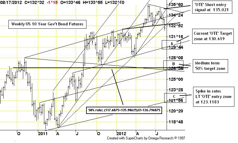
08/17/12: In very light holiday volume we have seen some dramatic price action through the past week. Most notably, the much stronger US jobs data (and a waning fear of recession) have put a top in the long dated government bonds and have pushed major stock indices to within shouting distance of the spring highs. The top in the 10 year US bond is so pronounced I have made it the subject of this week's WCTS blog spotlight. Seeming to confirm this 're-flation' notion, commodity prices in general are moving higher across the board and most recent posts on being long the commodity heavy TSX 60 and in some of the Softs markets all seem to be working.


As we move our way through this 17.5 year 'fear' cycle (expected peak Q3, 2017) there ought to be a general preference towards income paying securities over growth [Please refer to CRI's Macro-economic analysis seminar for more detail]. The fear of recession (both locally within North American and globally) coupled with a credit crunch has had investors running to 'safe' assets, like US Government Bonds, for a few years now. This trend can be clearly seen in the chart above - where US Government Treasuries have enjoyed a rather dramatic bull run over the past few years.

While we know that this macro trend ought to continue for at least another five years, we also know that there ought to be pockets of 'correctionary' price action along the way. Short periods of time where the market cleans up any 'overbought' conditions before laying the groundwork for another leg higher. This is the point where I believe the market currently is. Not a new long term trend - a correction within a long term trend.

A rising bond market is in itself a deflationary situation - literally a lack of fear of inflation. The bursting of the US housing market bubble was the catalyst for the current 'dis-inflationary' spiral we are in now. Indeed, interest rates have move dramatically lower but may not clearly reflect the current situation. Economic data from North America is generally getting better as the FOMC has literally kept the gas pedal floored in an attempt to stimulate the economy. With the recent top in the bond market and an associated breakout to new highs in the stock market, one might come to be belief that the gas is finally reaching the engine.

So where might prices go over the near term if indeed there is a top in the bond market? The chart above clearly illustrates my three target zones should the recent top hold (please refer to chart above). These include a very healthy correction back into support around 130.6 (Point A.), a full correction back to the 50% level of this entire bull run around 126.80 (Point B.) and finally the 'all hell has broke loose' target back at the long term support around 123 (Point C.).

It is interesting to see that the US bond market set up an almost perfect 'OTE' short entry point around 135. It is interesting too that a move back to the refered to points above would represent interesting 'OTE' long entry areas.


That's all for this issue of the CTS Spotlight,
Brian Beamish FCSI
the_rational_investor@yahoo.com

Sunday, August 12, 2012

CTS Spotlight Blog, TSX, for August 10th, 2012

Hello and welcome back to CRI's CTS Spotlight Blog.

They say, when it rains it pours. To that end, here is yet another CTS Spotlight Blog entry for you to consider in the coming trading sessions.

There appears to be a general consensus on what to do about the European debt situation, how bad it really is and who could be potentially affected. There have also been very stern comments from the ECB suggesting they will do 'whatever is necessary' to defend the Euro-FX. Couple this 'capitulatory' talk with surprisingly bullish jobs data out of the US, a Fed ready to add liquidity (not take it away) and very robust corporate earnings and it is my belief that the late spring/early summer 2012 correction is behind us. Consider too that we do have an upcoming US Presidential election in early November. I only mention this last part because we very rarely have a collapsing market into such events. 

From a contrarian perspecitive, it is Interesting to see that even though many of the world's indices are approaching their spring highs (and in my opinion starting to point higher in earnest) there remains a rather large bearish sentiment in the market - suggesting there are still plenty of investors either short or sitting on the sidelines. Should The Dow, Nasdaq or the S&P break to new highs, we could see a mass rush of buying on the 'don't miss the boat' trade.

So why am I mentioning all of this? Canadian stocks have been hit especially hard through this seasonal correction. Because of Canada's heavy reliance on the resource sector (a volatile sector by definition) Canadian investors have to face more and more volatility in their portfolios as we head into the 17.5 year 'fear' cycle peak. It's not much fun on the way down - but oh boy it can crazy on the way up. (which of course we all know exactly when it's gong to happen - right? If you answered NO to that question maybe you should go take CRI's macro-economics seminar to brush up on your fundamentals). Times ought to be very good for Canada in general over the next five years but any news/fear of recession in the US can/will lead to dramatic month-to-month price swings like we just saw over the past 4 months. Recent upbeat US jobs data, a very healthy yield curve and strong corporate profits are not the hallmarks of recessions and I do NOT believe the US is there at the moment. Once the US election is over and we are facing 'the fiscal cliff' I believe all bets are off and am probably going to suggest going to 'cash' at that point. But that is four months away and over the interim prices look to be heading higher - not lower.

So now on to the chart. The first thing that jumps at me is the fact that the 50% level is almost 40 points higher than where we are now. Yet the recent lows are only 20 points lower. That would represent a 2:1 risk reward model. Addtionally, this market is current within both the 2 year and 1 year 'OTE' zones suggesting again that the risk/reward model is tilted towards the reward side.  

I would advise taking some time over the coming week to look seriously at 6-12 month call options (on your most favored ETF proxy....for me probably the XIU March, 2013 $17 call currently $1.05 offered TMX link or about twice what I want). If I can find one where the price paid today is half (or less) what the intrinsic value of the option will be should prices move to the 50% level, I might just pull the trigger - seems like an interesting OnlyDoubles trade, no????

That's all for this issue of the CTS Spotlight,
Brian Beamish FCSI
the_rational_investor@yahoo.com